Diberdayakan oleh Blogger.

Project Review: The Bleeding-3D Logo designs for Key Art and Motion Graphics Advertising 2008

 For this 3D Logo I designed for the film, The Bleeding, I did a curved front face with red painted extrusion with a bit of back lighting.


 We did the blood on red so it would be a second read[ squint and see].


 A bit of green tint in the metal along with a warmed up light rig made this angled shot fun to layout for the Key Art.


 A brighter version on Green with the blood drips using the wax material which is a Sub-Surface-Scattering material so the light comes thru the this spots like real blood.


 A very bright version of the 3D Logo over a metal wall.

 My fave! Red extrusion curved dark face with highlighted edge lit blood drops in the 3D design.


Project Review: The Bleeding
3D Logo Design Exploration
Key Art and MGFX Design

Client Anchor Bay Entertainment via The Cimarron Group.
Art Director(s): Calvin Sumler and Joseph Stamper.
Project Date: April 2008.

I am often given a quick one day or half day gig to do a logo in 3D. Some clients get the capabilities in 3D and give me some room to explore, and others just want a boiler plate metal extrusion in some sort of chrome.

For this project, they wanted to try a few things to a metal logo that was "blood" oriented, so I gave it a STAB!

The main idea was to have some subtle dripping blood coming off the lower edge of the logo. You will see in one comp we did the dripping blood on red so it was NOT a first read, but the motion of the drops is what would "catch your eye' to the action on the lower edge.

I also cut the extruded logo horizontally with about 100 slices so I could bend the face to a curve. Flat faced logos are not good in chrome, they are too flat for a nice reflection, so I add a bit of crown to the surface which forces the horizon to the high point in the design. This is an old car designer trick to fix a surface, just add crown!

All in all though it did not finish, a fun experiment in design. I especially like the one with the red extrusion in the metal with a bright face and drips.


Cheers, THOM
read more "Project Review: The Bleeding-3D Logo designs for Key Art and Motion Graphics Advertising 2008"

2011 Honda CR-Z Development Video


2011 Honda CR-Z Development Video

2011 Honda CR-Z Development VideoA film charting the development of Honda's new, sporty hybrid coupe - the CR-Z. The film features the CR-Zs project leader, Norio Tomobe, and one ...

read more "2011 Honda CR-Z Development Video"

car design


formal inspiration in car design
read more "car design"

RS


read more "RS"

Project Review:The Fog-2005 Key Art 3D Illustration

 A re-post of the final 3D illustration that I gave over to Calvin to finish out for The Fog.


 An overhead view of the virtual set I built for the shot. the non seen walls are just boxes to block out the light[ I hid the back wall and ceiling see wires]


 A close up of the details in the panel door made from routered parts, as well as the bead board interlocking design set. I always model as much as possible vs. using texture maps, it helps a whole bunch with lighting and the final look of your scenes.


 A camera view w/o textures and lighting[ grey-scale]


 An up-shot of the door was an alternate idea we were going to have the kid block out the foreground lower on the floor.


 Here in quad view we can see the scene from outside showing the volumetric lights and the blocks in place[ an old trick I learned doing set design Live action] 


Project Review
The Fog-2005
Key Art 3D Illustration

Client: Columbia Pictures via The Cimarron Group.
Art Director[s]: Myself and Calvin Sumler.
Project Date: February 2005.

Back in 2005 while in-house at The Cimarron Group I worked on the remake of the 80's horror film, The Fog, for both the Motion Graphics department ran by Roland Mesa, as well as for the Priont Advertising division as well for Key Art posters. 

Today I post a comp idea that I had. My role at Cimarron was that of a Sub-Contractor providing specific 3D assets, so I usually was not given this type of opportunity, but when I was given the chance to pitch an idea, I enrolled the help of the very talented Calvin Sumler to build the comp, and he happily accepted.

A simple idea from the script, at one point the child of the main character was trying to keep the FOG out of the house, as the ghost pirate would rap on the door, so you would let them in. In one scene, the kid tapes the door frame so the fog cannot seep in and for the comp we had a backshot on a head with a kid huddled looking at the above door with the light coming in the cracks he missed.

I added lighting blocks outside to make it feel that someione was standing on the other side, and we added a green tint to the "Evil Fog" as well.

A bunch of items in here Cimarron sells on TurboSquid, so I used the door window, basketball, and the bear from my stock catalog.

Cheers, THOM
read more "Project Review:The Fog-2005 Key Art 3D Illustration"

Behind the Art: Napkin Sketching PART XIII

 A Sketch for a fish with fangs, a bit shark mixed with whale and a vampire!


 A Cartoon styled old prop plane[ WWII-ish ]


 Yet another GumboMan Swamp house on stilts, the concept comes back alot in my doodles...


A tall thin character with a very loooooog chin.

Napkin Sketching Part XIII
 
 In this thirteenth installment of the Napkin Sketches, Drawings, and Doodles I do when I have a pen in hand, I have put up a variety of Characters, vehicles, and a background design for todays late 2D posting.
I sketch to stretch. It keep me limber as a designer, and using digital tools all day long it is very helpful to break out of that mold and use you skills elsewhere. 
I also do woodworking, coppersmithing, and various building projects to keep me sane along with these sketches. Keep a good variety of what you draw, and what creative activities you do, and never pass up a real challenge.

You can view the other parts as follows:

PART I

PART II

PART III

PART IV

PART V

PART VI

PART VII

PART VIII

PART IX 
PART XII

Cheers, THOM
read more "Behind the Art: Napkin Sketching PART XIII"

Project Review: Indiana Jones and the Kingdom of the Lost Skull[ IV] PART II: DC-3

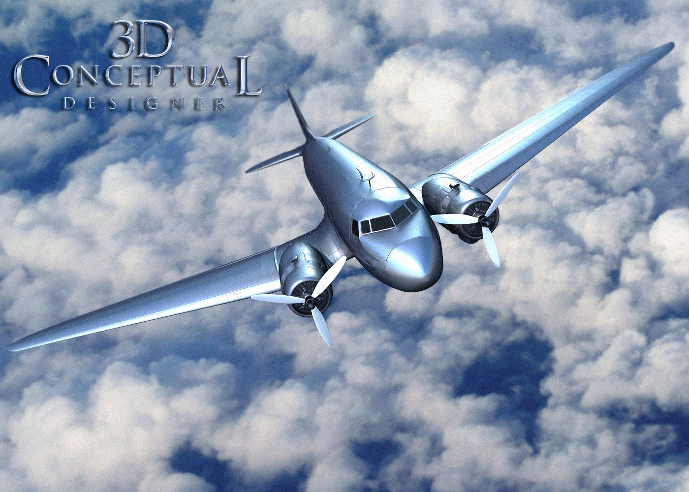
 The DC-3 I built for some Motion Graphics pitches done at The Cimarron Group in 2008.


 A side shot showing the modeled panels, rivets, metal warps, and gaps[ no texture mapped fakes]


  A shot showing the engine pod detailing on the DC-3 from Indy 4.


 A Grey scale render showing the surfaces smoothed near the nose.


  A Grey scale render showing the underside of the plane, seen in bank shots.


  A Grey scale overhead render of the plane I made for Indiana Jones 4.


  A Grey scale render Showing the wing details with a back-light catching metal buckling on the wing skin etc.


 A Quad view of the model with sub-division OFF.


 Indian Jones and Kingdom of the Crystal Skull
PART II: DC-3 Model


Client: Paramount Pictures
Art Director[s]: Calvin Sumler, Joseph Stamper, and Chris A. Hawkins
Date: Spring 2007


This is second post for Indiana Jones four, The Kingdom of the Lost Skull, showing the work I did for the advertising key art, and especially for Motion Graphics work.

Today, we look closer to the DC-3 plane I built for trailers we pitched for Indy. We went with the red line animated on a map look from the films interstitials, but updated it to the plane POV done in full 3D. The animator Ehren Addis, a pilot himself, rigged and finished the work out for them.

The MGFX team bought a model online but it lacked the details, and the level of finish needed to sell the idea, so I was tasked at re-doing the entire outer skin of the plane. 

You can view PART I here.


Cheers, THOM
read more "Project Review: Indiana Jones and the Kingdom of the Lost Skull[ IV] PART II: DC-3"
Copyright © automotiveidea. All Rights Reserved.
Blogger Template designed by Big Homes.